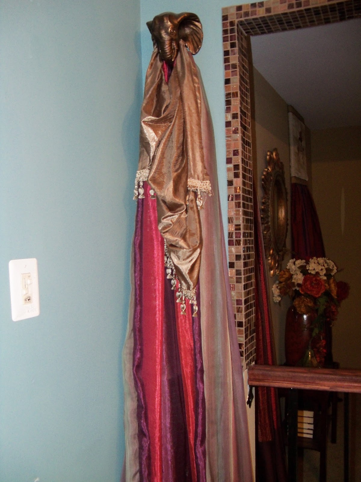
Another pitiful before shot, but I am trying to show the simple retail panels I had hanging from the elephant heads on each side of the loft opening.
These are a lovely maroon and purple striated effect. The colorful piece on the top is part of a skirt, just to add a pop of color.

Then one panel was draped over the bachelor window. Pretty but nothing to write home about.
Remember, these are old photos. I am much more classy now...tee hee.
I really love the color of the panels but wanted to make them look more PLUSH....professional. I had been saving the striped sheers for some time, wanting to use them in the dining room but not wanting a washed out color scheme. I LOVE BOLD COLOR! So we decided to re-use what we have.
They are not washed out if they are kept WITH a loud color.
I basically just turned both curtains face to face and sewed like a pillow case, leaving the top open. The sheers where longer so I cut them off at the top and serged leaving just enough to turn under as I sewed it to the maroon panel almost to the end. Then flipped it right side out through a little hole I left. I then sewed that hole closed, with the sewing machine (I almost NEVER hand sew anything). I ran a piece of wire through the rod pocket to hang. I didn't iron a tight crease on the edge since I wanted it to hang loosely and blend as if one piece. In effect, I just lined the back of the maroon panel with a sheer panel.
That topper piece is from the set I used in the kitchen bay windows. I was lucky enough to find a huge set, like a dozen or so, when I bought those at the thriftstore. Quiet honestly, when I bought them, I had no plans for them but decided to just buy them to reuse the tassel trim. Hey, that stuff is expensive!
DON"T THESE LOOK SO MUCH MORE PLUSH?
Again, too fancy for the real estate agent.....what do you think? I know that my tastes are eclectic but is it THAT over the top? It will just be really hard for me to take this down and still think it looks as good as it can. Without these types of touches, it looks like an apartment. But maybe that is the point. Hmmm.


No comments:
Post a Comment